
1 min read
Does predictive data limit ambition or maximise potential?
The short answer: it all depends on how you use the data. Teachers are not fortune tellers or magicians despite the wonders they can often work....

"Prediction is very difficult, especially if it's about the future."
- Nils Bohr
At Cambridge Insight, we make predictions by applying statistical techniques to the data we have on the exam performances and baseline measures of students.
Schools and other education institutions provide us with the exam results of their students, and we match those results to earlier baseline measures of students’ abilities.
For each exam subject and baseline combination we then have a dataset where we know each student’s baseline measure and their later exam outcome. We then apply ordinary least squares linear regression to the matched dataset.
The following discussion focuses on predictions to GCSE but the same principles apply when we predict to any qualification type whether it is Scottish National, AS Level, A2, or other Level 3 qualifications such as the International Baccalaureate.
As an example, Figure 1 shows outcomes in the Maths 9-1 GCSE against MidYIS year 7 National scores, with the fitted regression line superimposed (in black). The regression line in this case has the formula,
GCSE grade = 0.1050 X (MidYIS score) -5.18
Once we have the regression line linking the baseline measure to exam outcomes, we can then apply that line to students who are yet to sit their examinations.
In this example if we know a student’s National MidYIS year 7 score we can then use the regression line to provide a prediction of their GCSE Maths outcome.
Suppose their MidYIS score is 106. At that score the regression line provides an estimate of, GCSE grade = 0.1050 X (106) -5.18 = 6.0 which is the centre of grade 6.
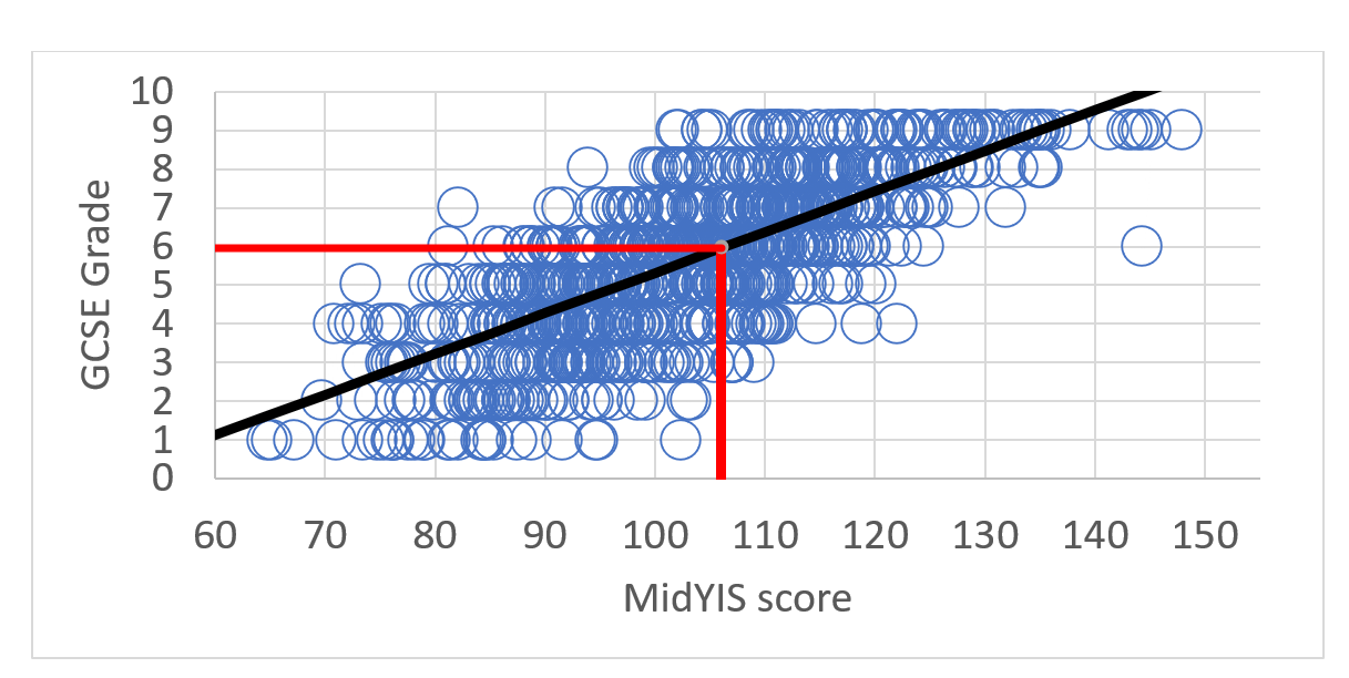
Figure 1. Scatter Plot with Regression line superimposed, GCSE (9-1) Maths
So what does this estimate of 6.0 mean?
From the chart we can see that there are actually a number of possible grade outcomes for a student with a score of 106 – not all students with that score achieve a grade 6. Some students did better and achieved a Grade 7, 8 or 9, and some did worse and achieved grades 1 to 5.
The value of 6.0 represents the average grade outcome for students with that score.
This process of calculating a regression line and then applying it to a student’s score is how we calculate what we call a “point prediction” – the single numerical prediction that each student is given for each of their subjects.
As well as the point predictions we can also use the data we have to calculate a student’s probability of achieving each grade.
Sticking with our example of a student with a score of 106, their chances chart for GCSE 9-1 Maths is shown below in Figure 2:
Note that if we work out the average of these grade outcomes, we obtain the value of 6.0 which is the same as the value given by the regression line.
We can think of the results shown in the Chances Graph as being a vertical slice of the data shown in Figure 1, taken at a score of 106.
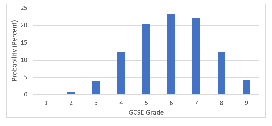
Figure 2: Probability of achieving each grade in GCSE (9-1) Mathematics for a student score of 106
The point prediction provides a useful starting point when thinking about target setting for a student, but a chances graph provides a much more realistic way to think about a student’s likely exam outcome compared to the single predicted grade from the point prediction. You can use the chances in discussions with students to encourage and motivate, as well as help guard them against complacency.
Another important point is to use the predictions together with your own knowledge of your students. In some cases, you may feel that the predictions and chances are too optimistic or too pessimistic.
By construction, the predictions and chances assume that a student with a given score is ‘average’ for a student with that score, effectively a random student drawn from the group of students with that score.
Of course, where you have knowledge of student’s particularly strong ability in a given subject, or where a student has particular challenges, you should adapt the prediction, or even disregard it.
We assess the accuracy of our predictions using two statistics, standard error and correlation.
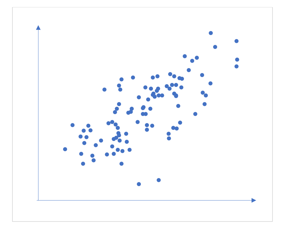
Figure 3: Scatterplot of two variables with a correlation of +0.7
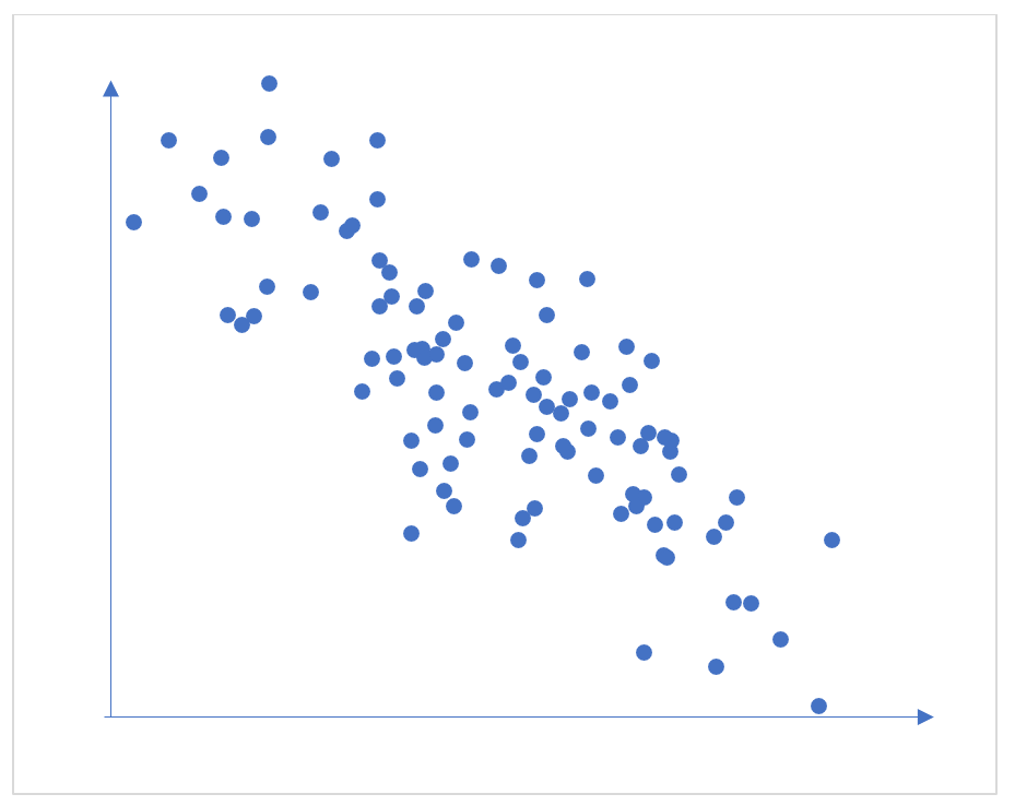
Figure 4: Scatterplot of two variables with a correlation of -0.7
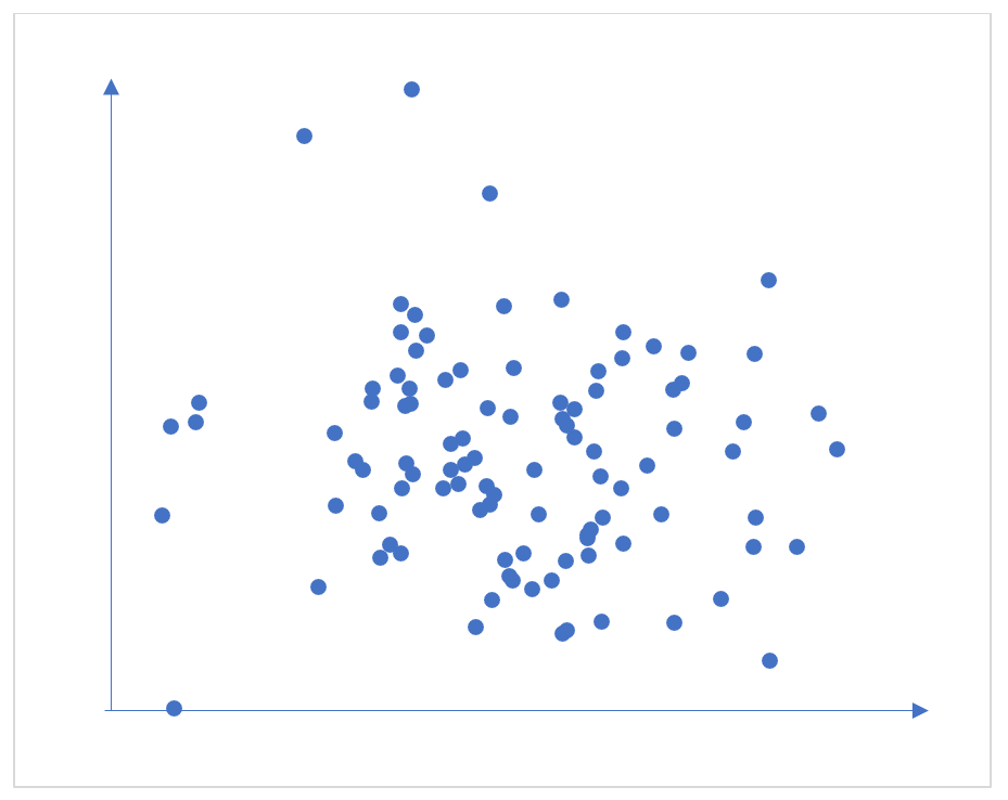
Figure 5: Scatterplot of two variables with a correlation of zero
Typically, in Cambridge Insight’s grade predictions we see correlations up to 0.8. These are strong correlations in this context - that of predicting students’ future exam outcomes after several years of schooling.
Used in conjunction with professional judgement the point predictions and chances graphs give you vital, forward-looking information which can help teachers keep students on track.

1 min read
The short answer: it all depends on how you use the data. Teachers are not fortune tellers or magicians despite the wonders they can often work....

1 min read
By Dr Matthew Carroll, Research Division, Cambridge University Press & Assessment When we produce an assessment, we need to know that it is measuring...

1 min read
Have schools got the ‘perfect’ system where every student achieves the grade they want? Unlikely. There are a number of factors that can get in the...