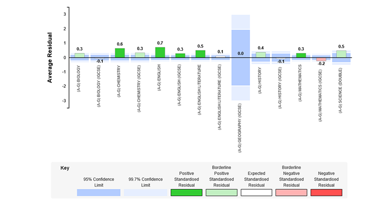
Things to look for
The ASR report provides school wide data, showing how each subject has performed. Subjects that have achieved significantly positive value-added (above what was expected) are highlighted in blue, while subjects that have not performed as well as expected are highlighted in yellow. Both blue and yellow subjects are considered significant value-added results, whilst white bars signify performance broadly in line with expectation.
Questions to consider
Why have some subjects performed either above or below what was expected? What factors could have influenced the value-added score for these subjects? Is there anything you can learn from subjects that have seen significantly positive value-added – what has that department done this year that has worked really well with students?
How do these results compare to previous cohorts?
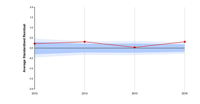
Things to look for
The SPC chart provides subject level data, allowing you to look at how specific subjects have performed over time. The Average Standardised Residual score is plotted on the chart – if this falls within the highlighted band, then the subject has achieved value-added as expected. Anything above this band indicates that the subject has seen better than expected value-added, and any scores that fall below the highlighted band shows that the subject has not performed as well as expected.
Questions to consider
What was the ability of this cohort? How close has the department come to achieving its targets? Is there a trend appearing in the results? It may be worth looking in more detail at cohorts with similar predictions, to see what difference there has been in value-added scores between these groups. If there is a significant difference, you may want to consider if there have been any factors that may have had an impact on these cohorts e.g. change of staff or a shift in curriculum structure.
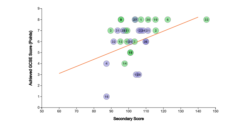
Things to look for
Scatter plots help you to see how your latest cohort has performed against their predictions. Any results that fall above the line indicate that these pupils have performed better than expected. Similarly, any results that fall below the line indicate that these pupils have performed below what was predicted. Results close to or on the line show that these pupils have performed in line with their predictions.
Questions to consider
Does the scatter plot show a cluster of pupils who have performed either above or below average? If so, you might want to try to identify groups (e.g. boys/girls, teaching sets, peer groups, etc.), or look at how these particular pupils performed in other subjects. You can look at the scatter plots alongside the table of results to see how each child performed across subjects. Have any interventions been particularly successful?